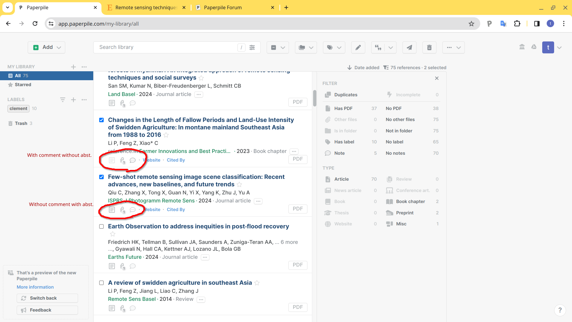
In the paper list screen, the presence or absence of an abstract and comments attached to each paper is indicated by the color of icons.
If items are present, they are indicated by a light gray color; if not, they are indicated by a much lighter gray color.
These color differences are faint and cannot be distinguished on some displays.
I would like to see more emphasize on the color difference between the icons, or hide them if the item is not present, so that the user can tell at a glance whether the item is present or not.
Thank you for your feedback on the color contrast of the abstract, attachment and note icons, @takahisa_amano. I have shared this with the team.