It would be great if labels could be shown more space efficient with multiple labels in one line. As soon as one has more than a handful of lables, using them becomes cumbersome as there is this long list one has to scroll through to find the right one.
1 Like
I came on here to make this same suggestion. There is a lot of wasted space on the side bare due to each label taking up its own line.
Instead of:
[Label1] (10)
[Label2] (22)
[Label3] (34)
…
I would like to see:
[Label1 (10] [Label2 (22)] [Label3 (34)]...
@captglasspac I don’t understand how that is better? Instead of a list to scroll through there is a blob to search through.
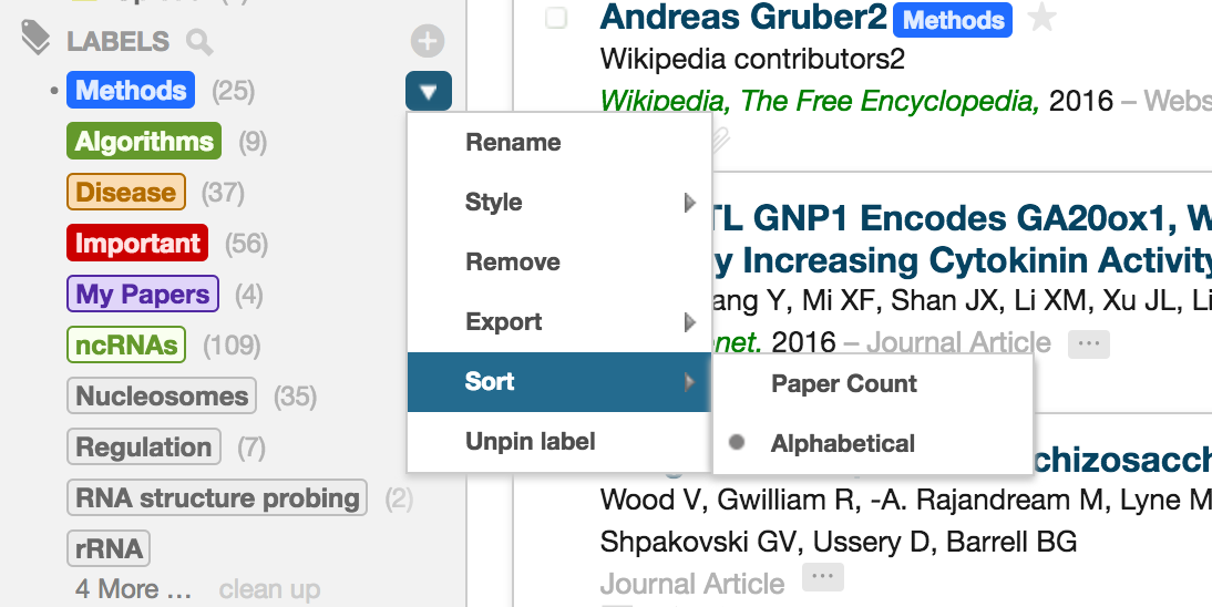
I would prefer an option to sort alphabetically rather than by the number of papers in the label.